Introduction
Ever wonder why some businesses choose to paint their walls with a particular color? Scientists have studied how color can impact our moods and emotions. When used correctly, it can affect everything from productivity levels to the way we feel about certain brands. In this post, we’ll explore how color psychology plays into commercial painting and why it’s important for your business.
- Introduction
- Color psychology has become an important factor to consider in commercial painting.
- The impact of color can be used to enhance the mood of a room and influence how people perceive it.
- A few key colors can help you create an immediate impression and appeal to your target audience.
- Colors are often chosen based on their associations with emotions.
- Some colors have different effects depending on whether they're used as an accent or as the primary color for a space.
- Conclusion
Color psychology has become an important factor to consider in commercial painting.
Color psychology has become an important factor to consider in commercial painting. In addition to creating a space that looks beautiful and is functional, you want your business to have a positive impact on customers. Colors can be used to enhance the mood of a room and influence how people perceive it. A few key colors can help you create an immediate impression and appeal to your target audience.
Colors are often chosen based on their associations with emotions, which means that some colors have different effects depending on who sees them or what they’re used for. For example, red tends to increase energy levels while blue makes people feel calm; yellow makes us happy while green helps us relax; purple evokes feelings of luxury or royalty; orange gives off vibes associated with warmth and comfort (think cozy sweaters!).
Colors also have different effects on people depending on their gender. Blue is said to be a calming color for men while women respond better to pink. In fact, there’s an entire industry dedicated to helping businesses use color psychology effectively called chromotherapy (a term coined by French scientist Dr. Hering).
The most popular colors for small businesses are blue, green, and red. Blue is often associated with professionalism, trustworthiness, and confidence. It’s a good choice if you want to project a serious image for your company. Green is often used in eco-friendly products or services because of its association with nature; therefore it may work well if your business focuses on sustainability or environmental concerns (though it should be noted that there are many other colors that can also be used to convey these ideas). Red is known as the color of love and passion; therefore it’s likely to resonate well with romantic customers.
The impact of color can be used to enhance the mood of a room and influence how people perceive it.
Color can be used to create a mood and influence how people perceive a room or brand. For example, the color red is often associated with passion and excitement, while blue is associated with peace and tranquility. If you want your customers to feel relaxed when they walk into your store, then it may be best for you to choose light colors that evoke these feelings instead of bolder ones like red or orange (which would make them feel more energetic).
You can also use color psychology in conjunction with other design elements such as lighting in order to enhance the overall experience of being in your store or restaurant.
The most effective way to use color psychology is through the creation of mood boards. A mood board is a collage that contains images and colors that represent what you want your brand to be, such as cool and modern or warm and inviting. This will help you choose colors that work well together while also inspiring you with new ideas for how they can be used throughout your design.
The next step is to pick the right color scheme. You can do this by selecting one or two hues that are dominant and then choosing other colors that complement them. In doing so, you’ll be able to create a cohesive design that makes everything feel like it belongs together.
A few key colors can help you create an immediate impression and appeal to your target audience.

When you’re choosing colors for your commercial painting project, it’s important to consider the impact of color psychology. A few key colors can help you create an immediate impression and appeal to your target audience.
Here are some tips for choosing the right colors:
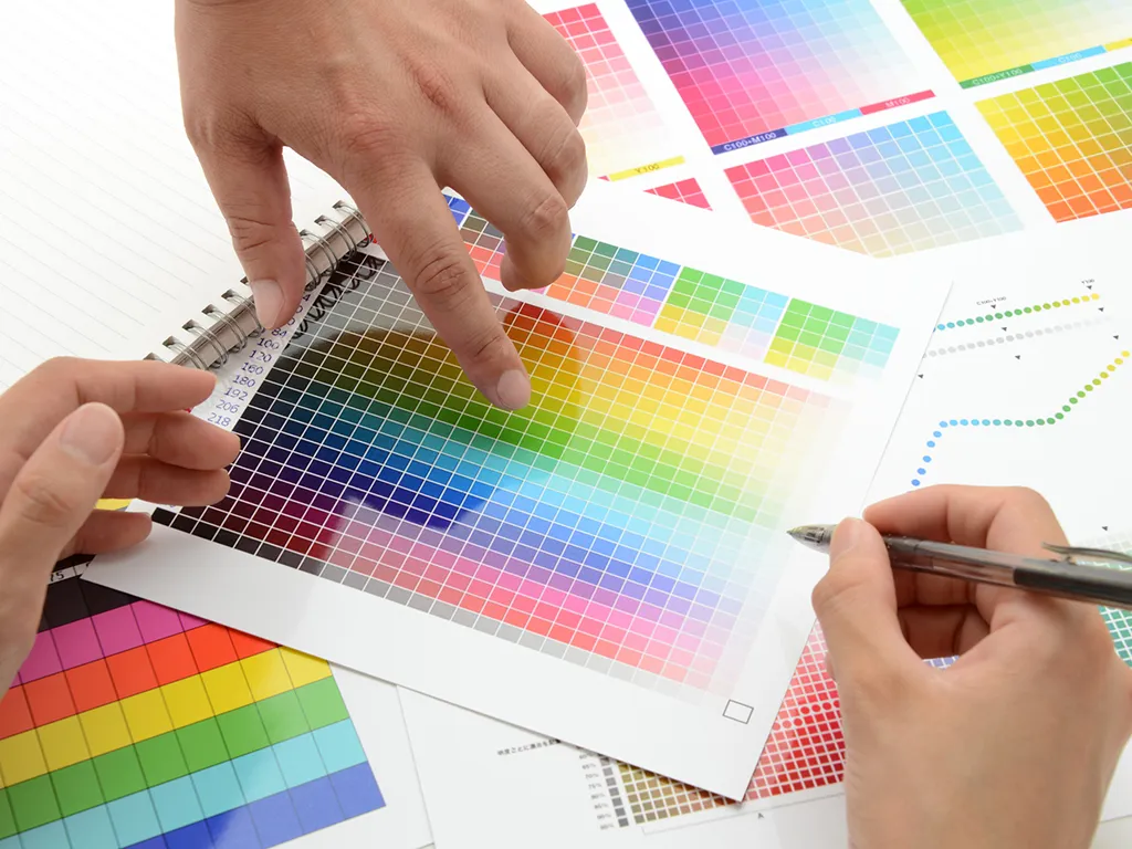
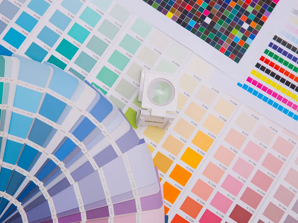
- Use a color wheel. Color wheels are great tools for matching complementary, analogous or triadic colors. This will help ensure that your paint scheme is cohesive while still allowing each individual element its own personality (and avoiding clashes).
- Choose complementary hues (opposites on the color wheel). Complementary pairs have an intense visual impact when used together because they’re so different from one another–they “complement” each other by creating high contrast without being too jarringly different in hue or value level. For example: red vs green; blue vs yellow; orange vs purple/ lavender/ pinkish-reds
- Use analogous hues (adjacent on the color wheel). An analogous color scheme uses colors that are next to each other in terms of hue and value level. It’s a bit less intense than complementary schemes, but it still provides high contrast without being too jarringly different in hue or value level. For example red-orange vs yellow-orange; blue vs purple
Colors are often chosen based on their associations with emotions.
Colors are often chosen based on their associations with emotions. Color psychology is a science that studies the effect of color on human behavior, and it’s used in marketing and advertising to influence how people perceive a brand or product.
- Red: This color evokes feelings of excitement, passion, and strength. It can also signify danger if used too much (think blood).
- Yellow: Yellow represents happiness, sunshine, and optimism; however, it can also signal boredom if used too much (think caution tape).
- Blue: Blue inspires calmness and serenity while promoting problem-solving skills at work or school because it has been shown to increase concentration levels when someone is working on something that requires focus for long periods of time (think navy blue suit).
- Green: Green evokes feelings of balance and harmony, which is why it’s often used in the corporate world. The color is also associated with nature so it can be used to promote eco-friendly products.
- Black: Black is the color of authority, power, and strength. It can also be used to promote sophistication and elegance if you’re looking to create a sophisticated brand image.
- White: White is the color of purity and innocence, which makes it a great choice for brands that want to convey those qualities in their marketing.
- Brown: Brown is a safe and secure color that evokes feelings of comfort and stability.
Some colors have different effects depending on whether they’re used as an accent or as the primary color for a space.
When you’re choosing colors for a space, it’s important to remember that some colors have different effects depending on whether they’re used as an accent or as the primary color for a space.
Accent colors are used to highlight a specific area and can be used in both large and small spaces. For example, if you want to draw attention to an architectural detail like molding or trim work, try painting it in one of your accent colors (like red). Primary colors are defined by their hue; they create contrast when paired with other colors so they’re often best suited for large spaces where there’s plenty of room for those contrasts to shine through fully.
Conclusion
The impact of color psychology in commercial painting is a significant one. It’s important to understand how colors can affect your customers, employees, and visitors, as well as how they make people feel when they enter your business or facility. By choosing colors wisely and implementing them effectively, you can create an environment that promotes productivity and creativity while also creating a positive mood among those who see it every day.


